Better Booking Flow Beats a Full Redesign
Most local service owners assume a new website will bring more booked jobs. In reality, the pages already on the site often lose ready customers because the path from “I need this done” to a confirmed visit is unclear or takes too many steps.
A full redesign is not always the answer. Improving the booking flow on the pages you already have can capture more leads this month without the cost or delay of starting over.
Why a Redesign Often Misses the Real Leak
A new design can make the site look cleaner. It does not automatically make the next step obvious or remove the friction that stops a customer from booking.
If the current site has traffic but few calls, the problem is usually the path, not the colors or layout. Ready customers leave when they cannot see how to book, when the form asks for too much, or when the next step is buried.
Owners often spend weeks on photos and new colors while the same booking gaps remain. The result is a prettier site that still loses the same leads.
The traffic you already have is valuable. Turning more of it into scheduled work usually requires clearer next steps, not a complete visual overhaul.
What a Working Booking Flow Does
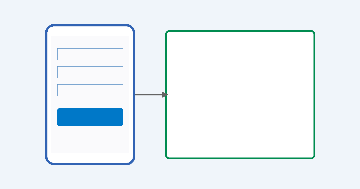
A good booking flow answers three things quickly: what happens next, how long it takes, and how to start.
It keeps the customer on the same page or moves them to a short form or calendar without extra clicks. The goal is a booked slot or a clear callback window, not another page of information.
When the flow works, the office receives a lead that already has the basics needed to schedule. Techs spend less time on the phone gathering details that should have been captured earlier.
Customers feel the difference too. They know what to expect and do not have to call back to finish the booking.
Common Friction That Kills the Booking
These issues appear on many service sites and cost jobs every week.
- The call or book button is below the fold or hard to tap on a phone.
- The form asks for address, problem details, and preferred times before showing availability.
- There is no option to book a specific window or see open slots.
- After-hours visitors see only a phone number with no way to leave a request that gets confirmed.
- The page talks about the service but never shows the next concrete step.
Any one of these can turn a ready lead into a missed call. On mobile, the problem is worse because the button is small or the form requires too much typing.
Customers who are ready today will not wait for a long form or a callback that may come tomorrow. They move on to the next company that makes booking simple.
Simple Diagnostic Checklist
Open your top service page on your phone and walk through this list.
- Can a stranger see the next step without scrolling?
- Is the button or form reachable with one tap?
- Does the form ask only what you need to schedule the visit?
- Can the customer pick a time or request a callback window?
- Does the page confirm what happens after they submit?
- Would your office staff say this matches how you actually book jobs?
If you miss more than two items, the flow is losing leads even if the design looks fine. Fix the gaps on the current page before you consider a larger project.
Most owners find at least three items that need attention. Addressing those first usually moves the needle faster than a redesign.
Example From a Tampa Bay HVAC Crew
A three-truck HVAC company in the Tampa area had steady traffic to their AC repair page. Most visitors still called the main number or left, and the office spent time on phone tag.
They added a short form above the fold that asked only for name, phone, and whether the unit was blowing warm air. A calendar link showed the next open service windows. Automatic text confirmation went out within minutes.
Booked jobs from the page rose in the first two weeks. The office stopped chasing basic details, and techs arrived with the right information already in the job file.
The change took less than a day to put in place. No new design was needed. The same page simply made the next step clear and short.
The crew now treats the page as a working booking tool instead of a brochure. The same approach works for plumbing, cleaning, or restoration companies that already have traffic.
Start With the Path, Not a New Site
Pick the service that brings the most calls or the highest-value jobs. Make the next step visible, shorten the form, and add a way to choose or request a time.
Test it for a week. Track how many leads become booked slots versus how many still require a phone call to finish. Small changes here often pay for themselves before any larger project begins.
Many owners discover that the current site already has enough traffic. The missing piece is a flow that turns that traffic into scheduled work without extra back-and-forth.
You can always improve the design later. First capture the jobs that are already trying to book.
A focused booking system on the pages you already have reduces the daily chaos of missed leads and phone tag. It gives ready customers a clear way to move forward and gives your crew a cleaner schedule. That is usually the better first step than a full redesign.